What are neutral colors? Why do we like using them?
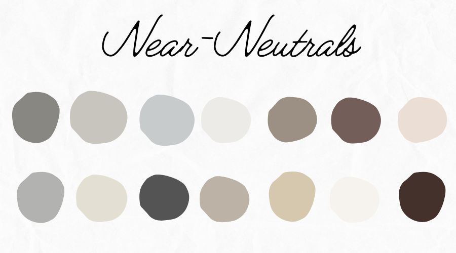
We’ve all heard the term “neutral colors”, but it can be hard to figure out exactly what that term means. Does it include browns and tans, or just colors on the black and white spectrum? What about earth tones? What makes a neutral, neutral? And why do people seem to like them so much?
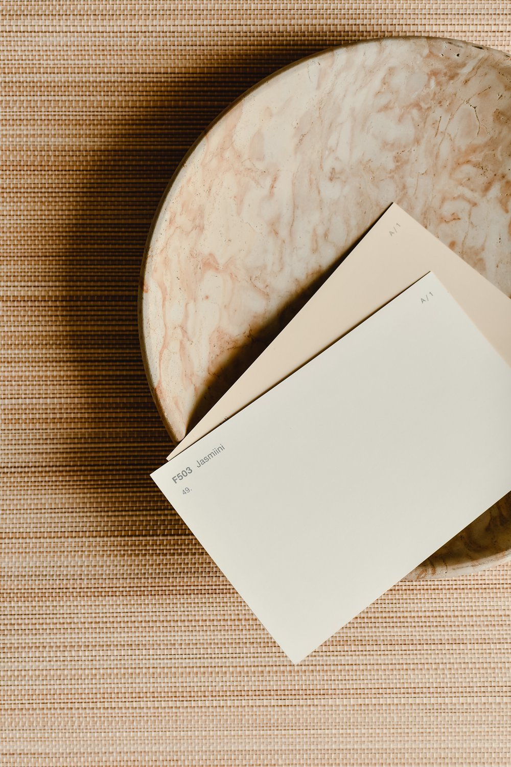
Image: Pexels/Eva Bronzini
Neutral, Defined
A neutral is defined as a color without any underlying hue tones. The only “pure” neutrals are white, brown, black, and gray, which are made by combining two complementary colors.
All other tones, like tans, greiges, eggshells, or ivories, have very slight hue undertones and are considered “near-neutrals”. For the purposes of home design, this is really a moot point, and a neutral can be defined as a color with very little hue undertones.
Image: One of our kitchen renovations
Why People Like Them
So, why do we like neutral colors so much, especially in home design? The biggest reason seems to be that they give the eyes a break and tend to act as a background, giving room for other things to stand out.
A hyper cluttered, hyper colorful doesn't ever give your eye a place to skim over, leaving you feeling slightly overwhelmed. Using a neutral color as a base allows you to direct people’s focus to specific pieces in your home that you want to be accented.
They also allow your mind to rest, giving the room a more peaceful atmosphere.
Paring a neutral with another color also makes it look more saturated by contrast. It also contrasts easily with most textures and patterns, allowing you to appreciate them more easily.
Neutrals tend to be more timeless, which makes it easier to like your style choices for a long time. Because of that timelessness, neutral colors increase home resale value, both on the outside and the inside.
Neutrals also work well with any decor style. If you like regularly mixing up how your style, consider using neutrals as your base. It gives you much more room to play with other textures, patterns, and accent colors. Our home renovation services blend creative design with expert craftsmanship, using soothing neutral tones to create warm, inviting spaces you’ll love living in every day.

Image: Duchess of Disneyland/Go away green
Leave it to Disney
It can also have the added benefit of distracting the eye away from things you don’t want people to see. Disney uses this trick in their theme parks to “keep the magic alive”. They blended their own paint color called go-away green that they use for this.
Anything they don’t want parkgoers to focus on gets painted that color: utility boxes, trash cans, staff entrances, or any part of the park that isn’t on theme. The color is a combination of the surrounding greenery along with a blend of neutrals that your eyes tend to ignore. With the magic of neutrals, the “unseemly” parts of the park seem to disappear. Check it out next time you make a visit!
Downsides
Of course, there are downsides to using neutrals. When overused, they can make rooms look bland, boring, or sterile. They lack personality and can make a home look more “cookie-cutter”.
However, when used rightly, they can be a great base to layer on your own style, personality, and taste.
How We Use Neutrals
The way we use neutrals varies depending on the client. After all, their home reflects their personal style, not ours! However, we do tend to have some connecting themes in our work:
1. Neutrals as a base, accent with color:
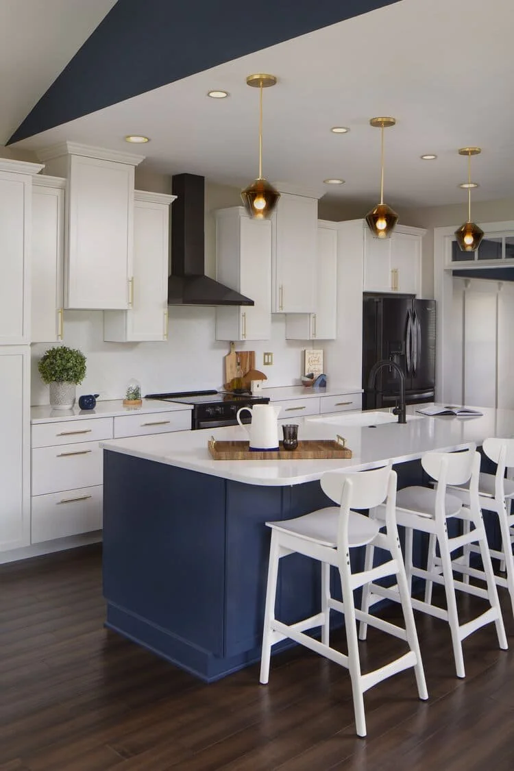
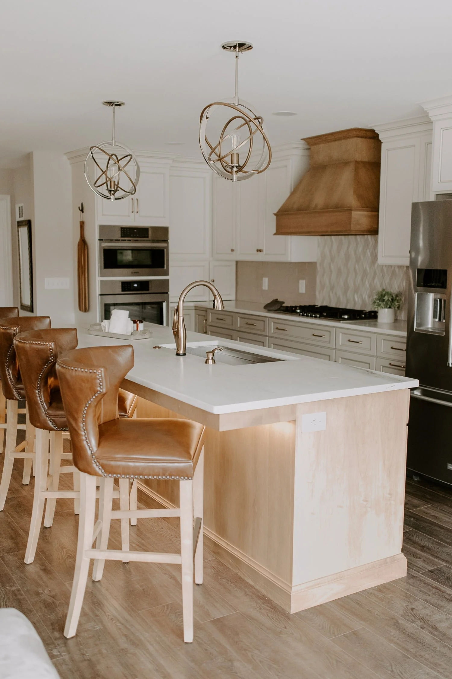
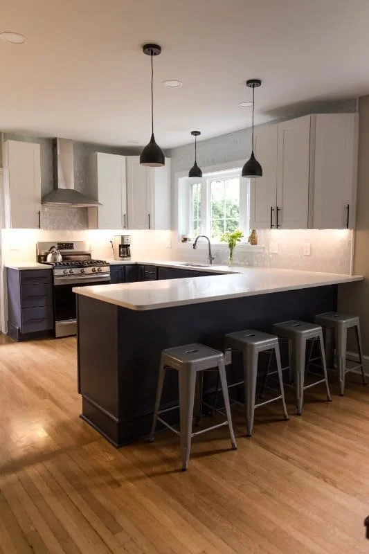
Neutrals often work very well as a wall color, which is why you see so many white and cream rooms. We tend to use a lot of off-whites, and then accent with color elsewhere. Kitchen cabinets are great for this, with colors like cobalt, sage, emerald, or navy pairing phenomenally. Here are a few examples:
2. Employ contrast:
Neutrals are great because their lack of hue makes it really easy to contrast with them, while not making a room look busy or overwhelming. Neutrals can contrast with a pattern, a texture, a bright color, or even another neutral with a different light value.
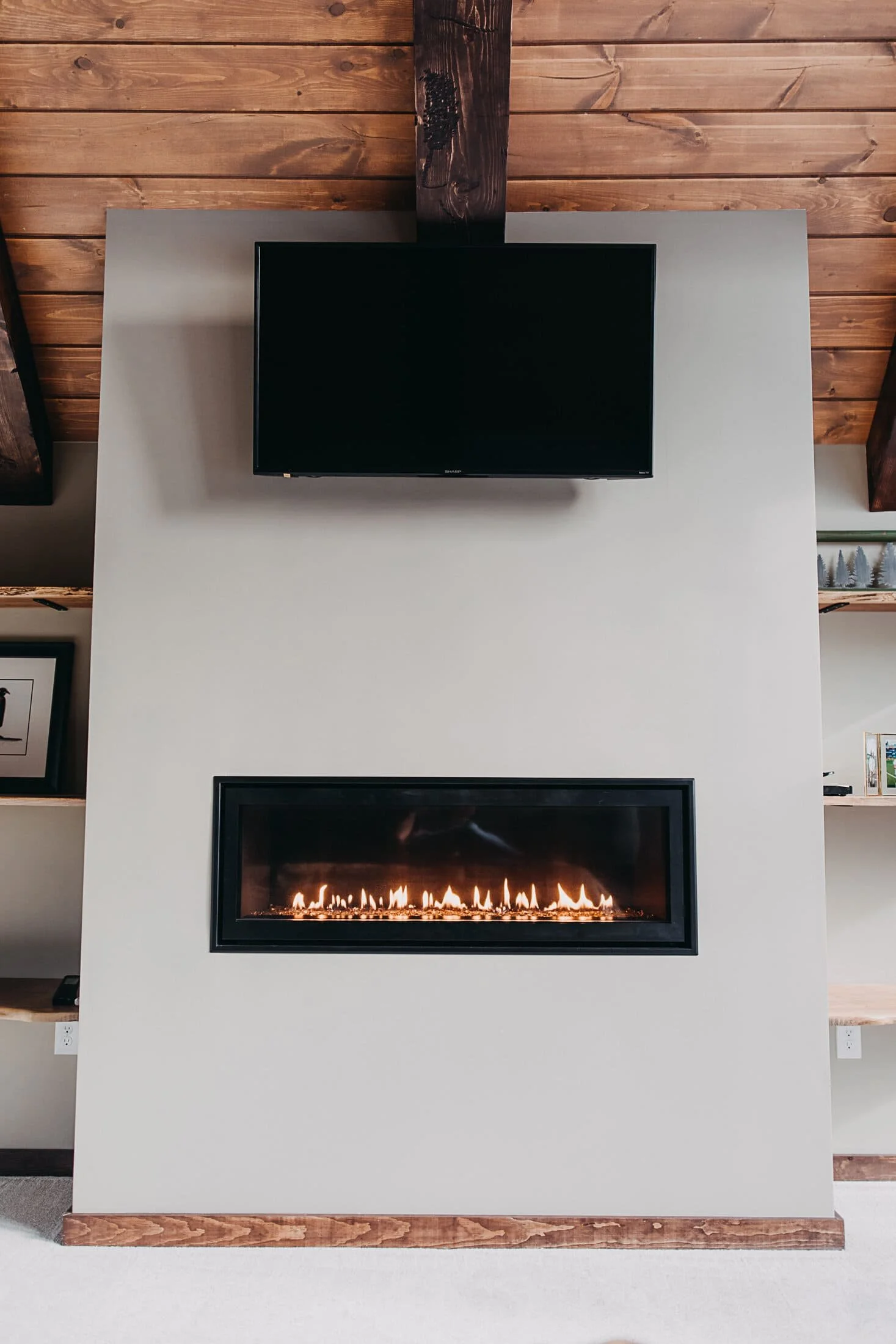
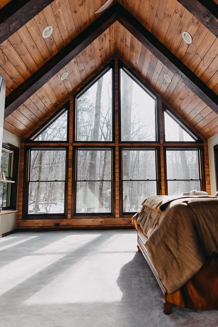
While these two photos are almost entirely comprised of neutrals, their difference in brightness and texture creates a gorgeous high-contrast room.
3. Texture work/accent with other natural tones
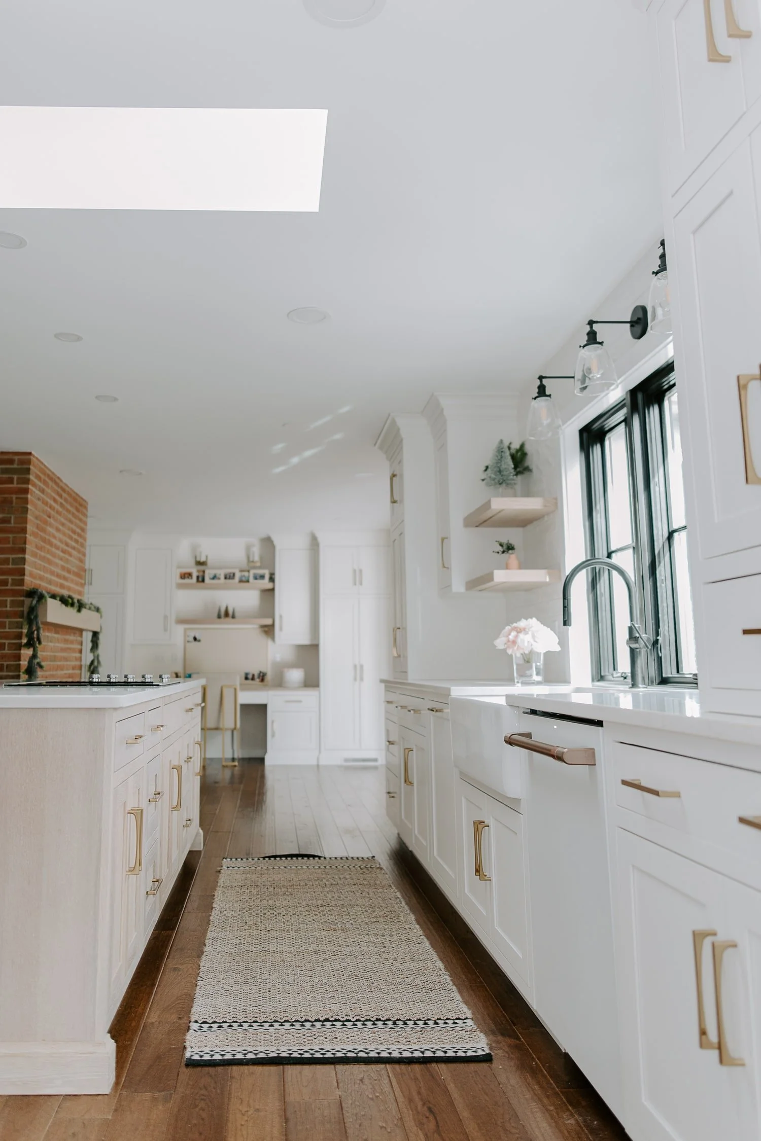
This kitchen, while being mostly neutral, works well because of its high contrast and texture like the throw rug, brick fireplace, metal, and multiple wood types.
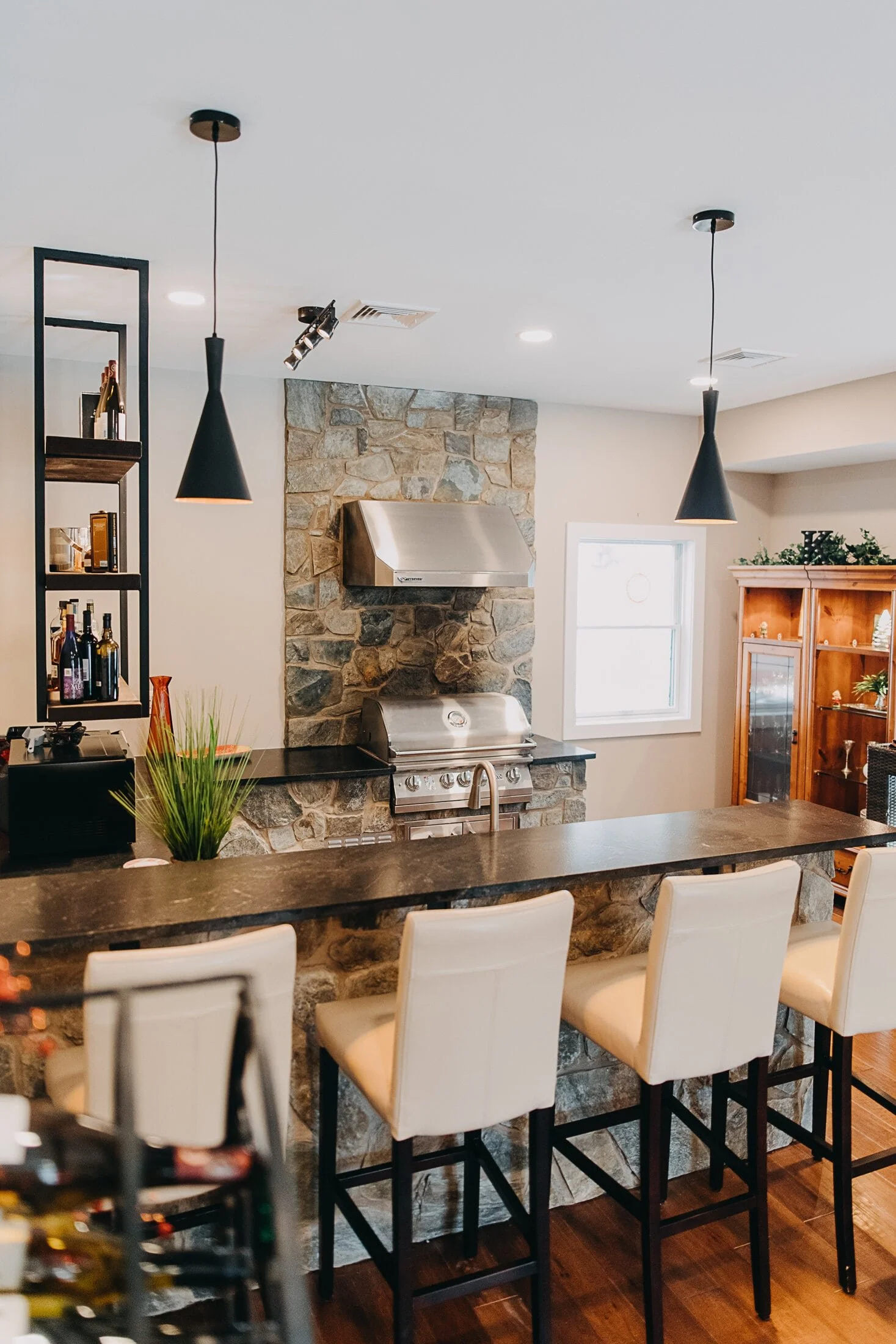
While also being rather neutral, the multiple stone textures sprinkled throughout keep the kitchen layout visually interesting.
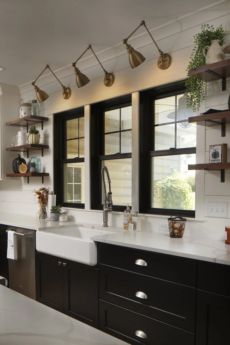
Light walls, countertops, and upper cabinets contrast beautifully with the dark flooring and black lower cabinets, even without much additional color.
Are you looking for a contractor to renovate or add on to your home? Get a quote from us to jumpstart your process!