Tile For The Win
Everywhere you look, white is the way to go. Why not? White is clean, it makes the room look larger, and you can change the accessories as often as you like. But be careful - too much white can look uninviting, cold, and (I’m going to say it!) boring.
One of our current projects is in Lancaster City, on a beautiful street with lots of older homes. The homeowners wanted to remove everything inside (including some walls). So even though part of the floorplan is new, we couldn’t change the footprint of the little guest bathroom upstairs. I’m not kidding - this bathroom is really small! Our challenge was not only to remodel the room, but to make it feel more inviting and interesting. This is what we began with:
Sorry about the image quality - we only use professional photography for the “after” shots! There isn’t much else to this tiny bathroom - just a pedestal sink and commode on the right side. The room is just over 40 square feet, and the tub and radiator take up quite a chunk of that real estate.
The homeowners chose gold fixtures in their master bath, and decided to keep the theme for the guest bath as well. Our challenge was to add something exciting to their mostly white palette. The floor seemed like a great place to add some personality, and holy moly, look at it:
How spectacular is this tile?
This porcelain tile is going to make a gigantic statement! It’s still a work in progress - the grout comes next, and then we’ll start installing the finished plumbing fixtures. There are warm golden accents in the tile which will bring everything together.
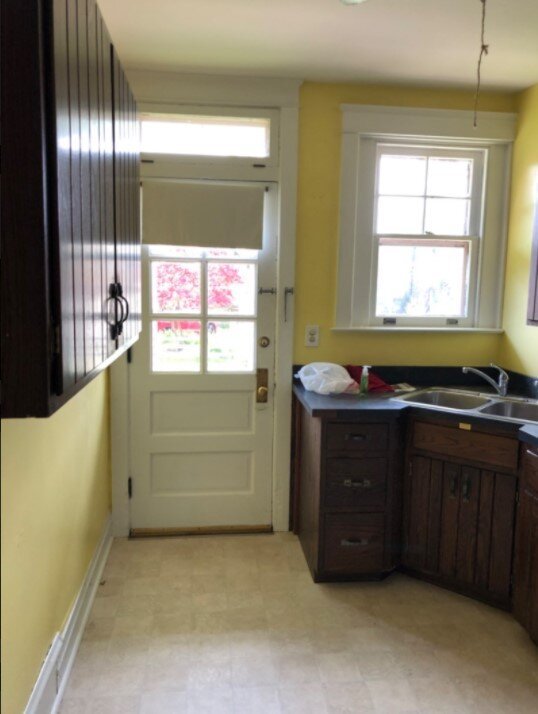
Since you’re already here, let’s have a sneak peek at the kitchen accent tile. But first, here’s the “before”…
Don’t worry; we removed the wall on the left to open up the kitchen.
Hello, Yellow!
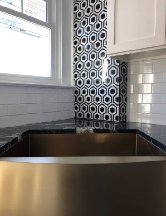
This kitchen isn’t large. It isn’t even medium-sized. That wall had to go, and we put an island in its place. The cabinets and backsplash tile are white, but there is new hardwood with a dark stain, and the marble accent tile is STELLAR:
True story: if this was my view from the kitchen sink, I’d volunteer to wash dishes a lot more often.
Accenting with tile is a great way to add your unique touch without overwhelming the design. It’s going to be impossible for anyone to walk into either of these rooms without saying “Wow!” We’re really excited to see this all come together, and even more excited to hand it over to the clients to enjoy. And when that happens, we’ll be sure to update with more photos!


